Graphic Design
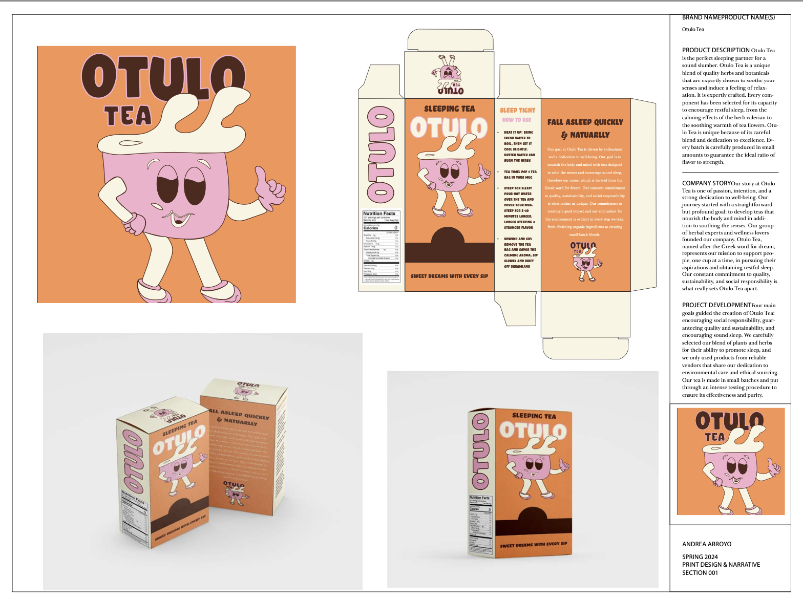
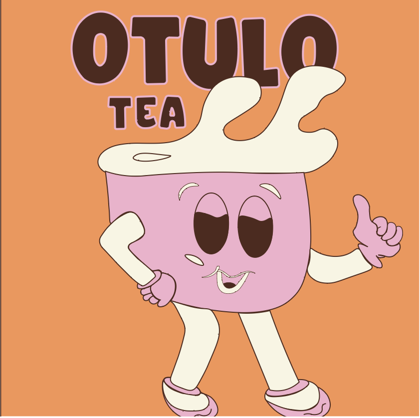
Otulo Tea - Branding Project
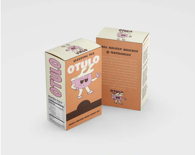
Otulo Tea is a brand identity and packaging project developed for a print design and narrative course. The goal was to create a cohesive, calming brand for a sleep-focused tea that communicates relaxation, wellness, and trust through visual storytelling.
I developed the brand name, Otulo meaning sleep in Luganda, along with the logo, color palette, and overall brand system. The branding was guided by product’s purpose of encouraging rest and well-being, resulting in a warm, approachable identity that balances playfulness with calm across packaging and print applications.
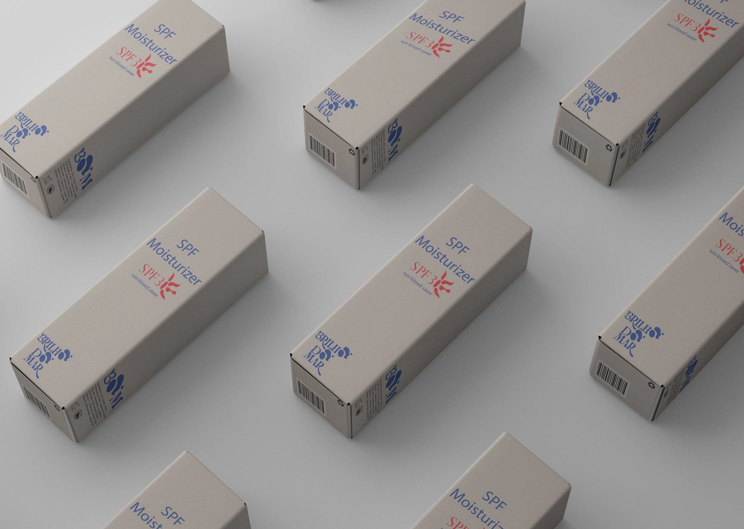
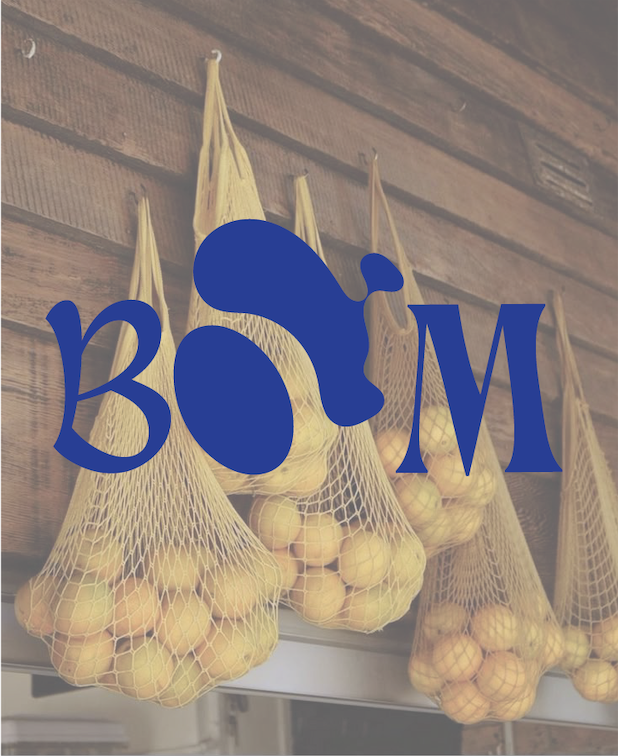
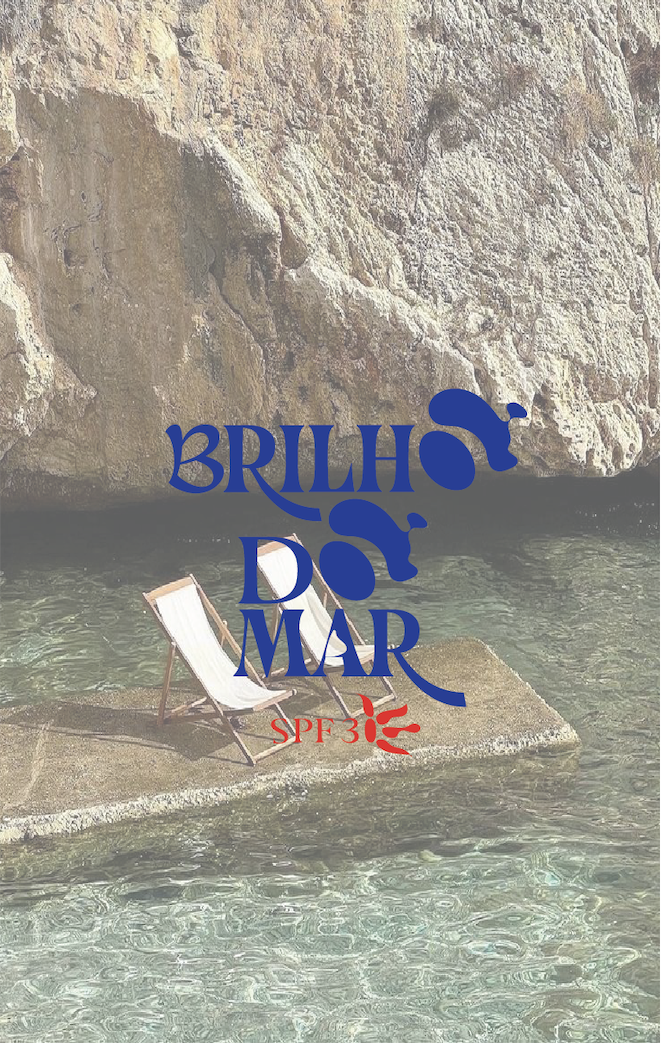
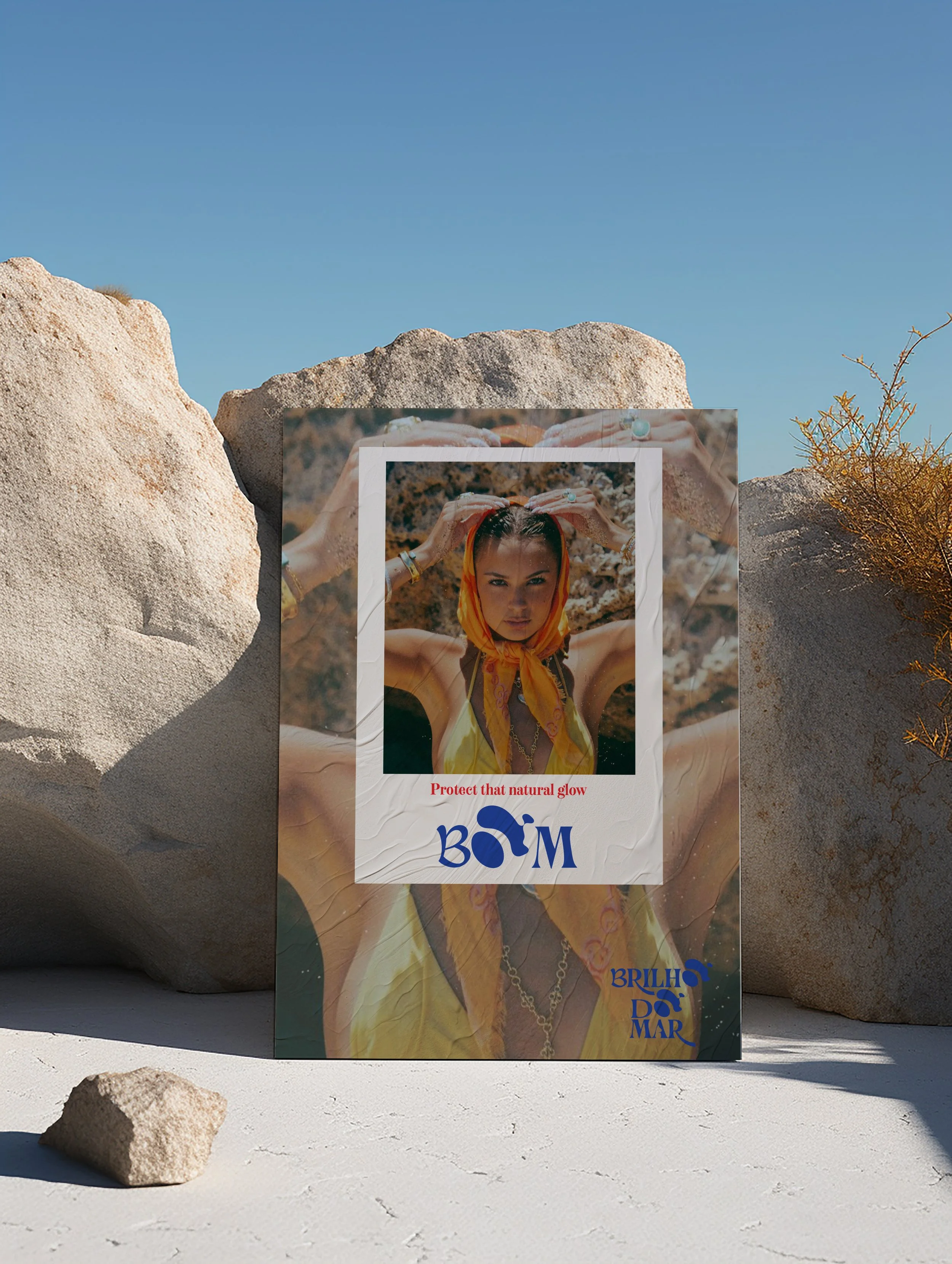
Brilho Do Mar - Personal Branding Project
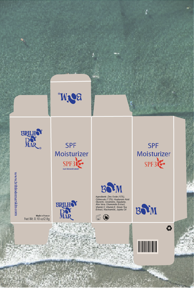
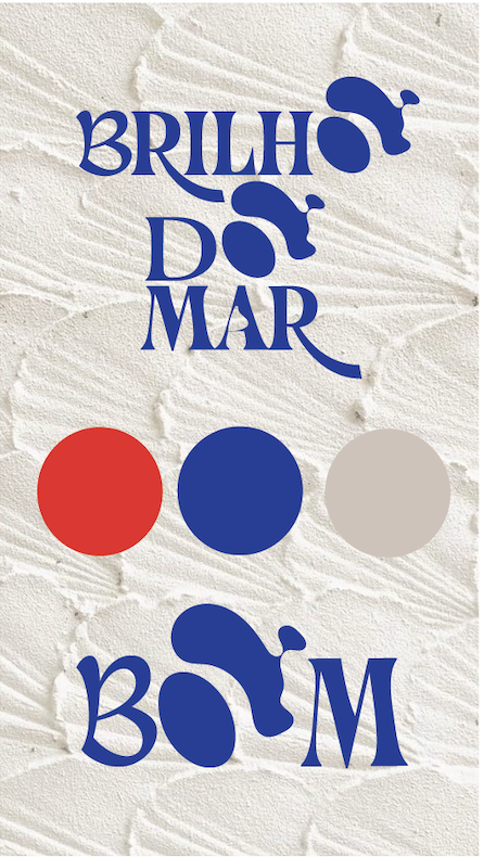
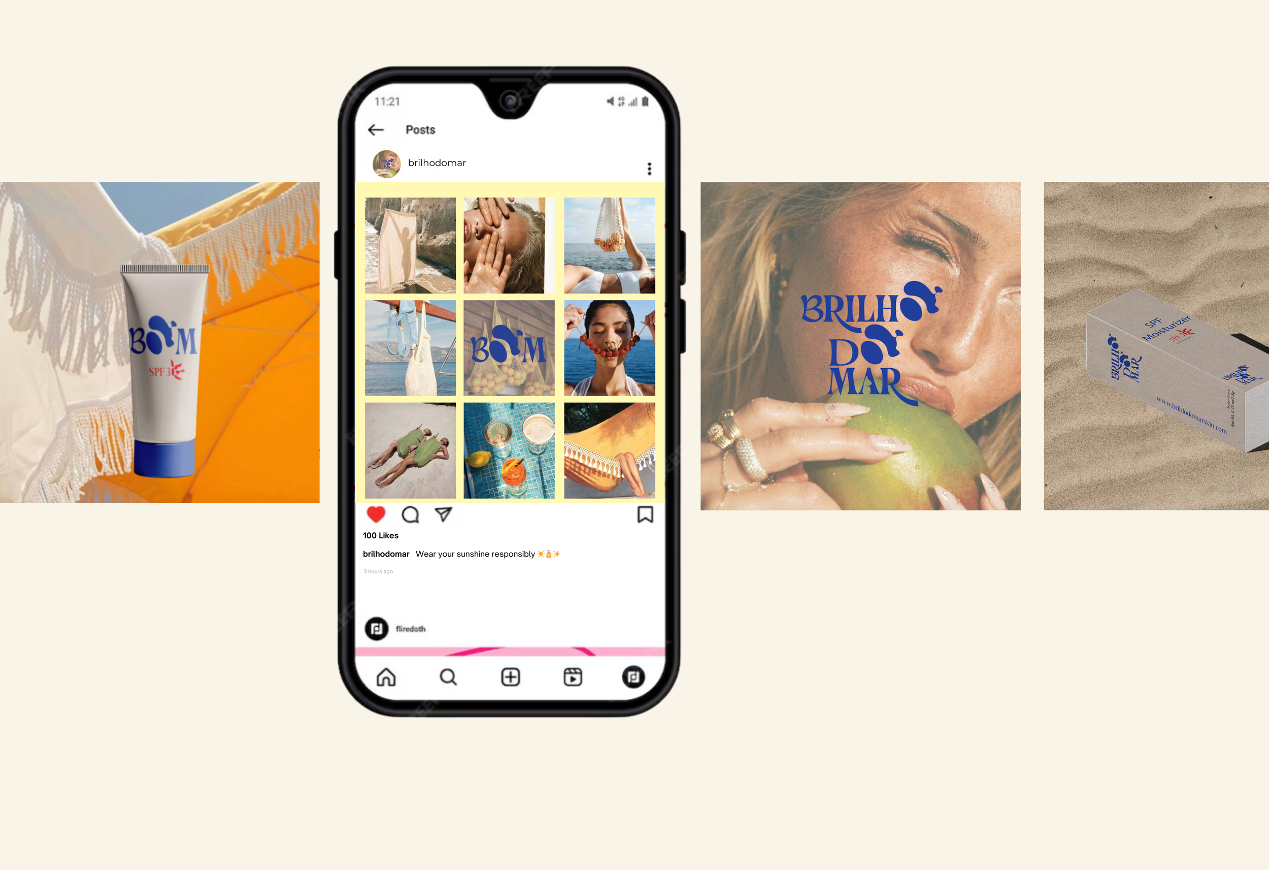
Brilho Do Mar is a self-initiated SPF brand inspired by the ocean, sun, and Latin American vibrant culture. The name translates to “Sea Glow” or “Brillo del Mar” in Portugues, reflecting both coastal beauty and cultural expression.
I developed the brand from the ground up, including the name, logo, color palette, and visual identity. The project explores playful, sun-soaked design through social media posts, posters, and digital assets, capturing the feeling of summer, protection, and effortless glow.
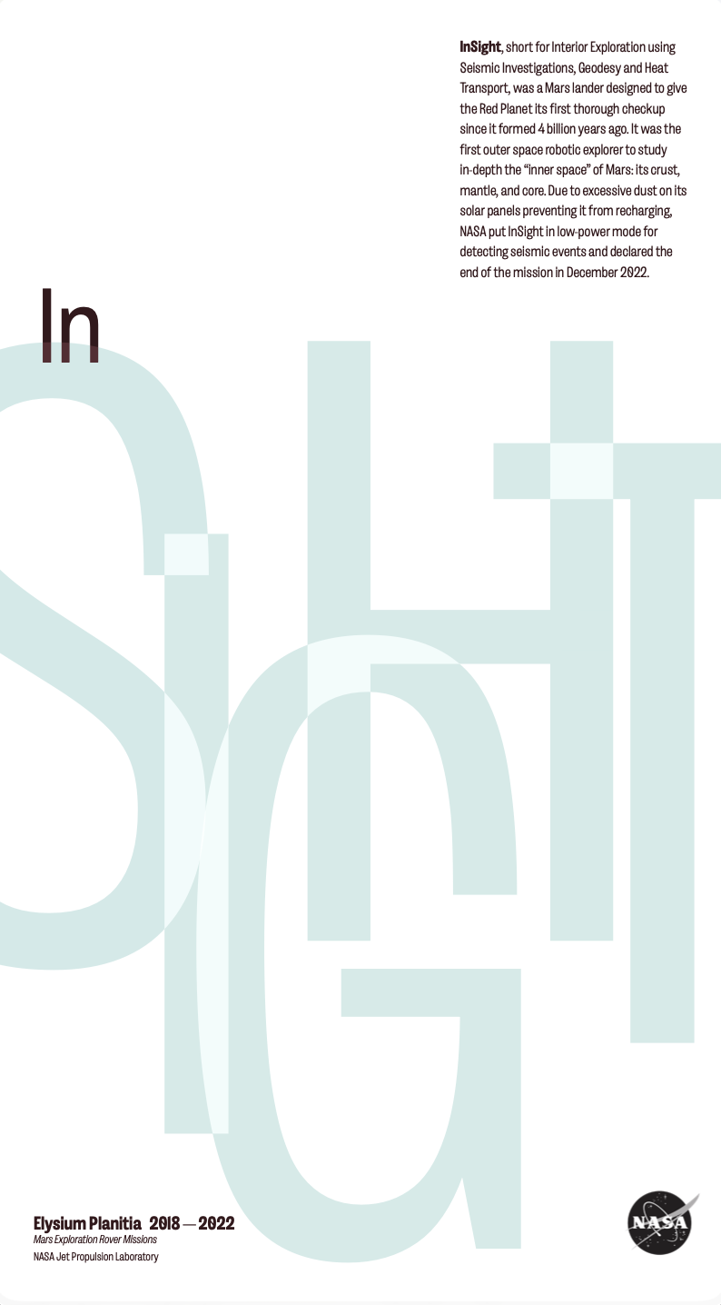
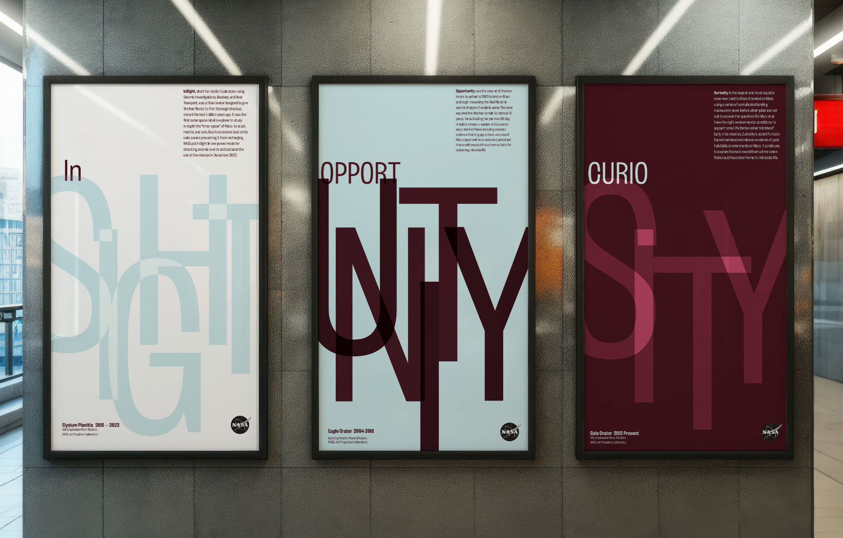
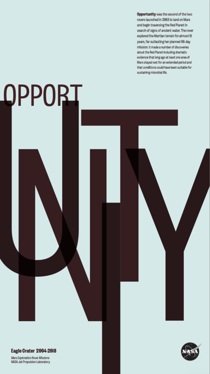
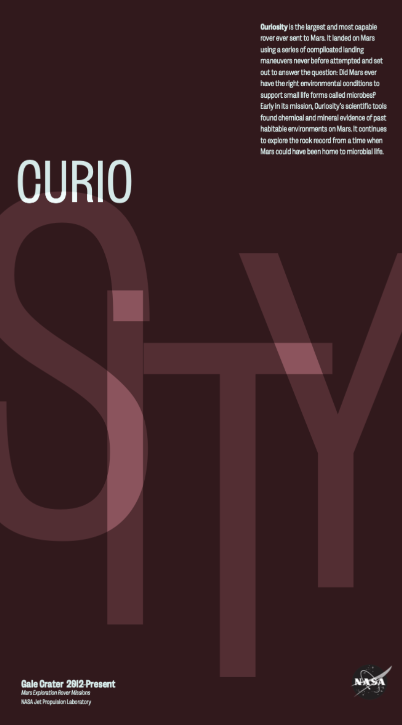
NASA Series - Poster Design
This poster series was created for a Typography Lab II course with a focus on experimental type. Each poster is named after a different NASA rover, using typography to visually interpret the ideas of curiosity, opportunity, and insight associated with space exploration.
The project explores scale, hierarchy, and letterform interaction, pushing type beyond traditional readability through overlapping forms, bold composition, and contrast. Typography functions as both image and message, emphasizing expression and visual impact.
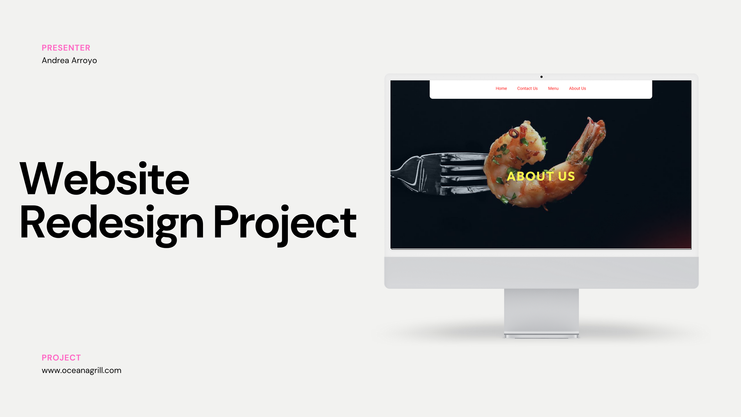
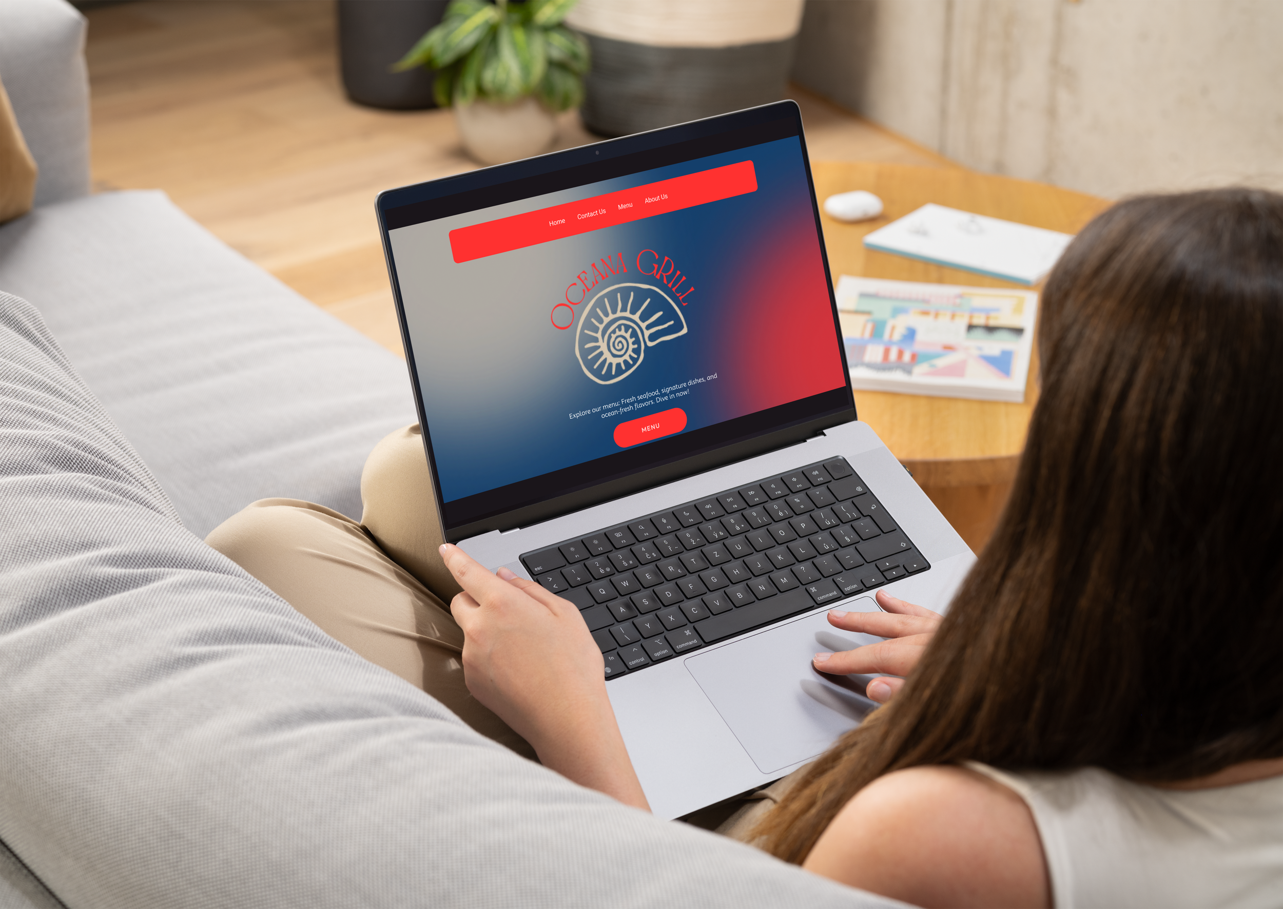
Oceana Grill - Website Redesign & Brand Refresh
This project focused on rebranding and redesigning the website for a well-know New Orleans restaurant to create a more modern, cohesive digital presence. I redesigned the logo and rebuilt the website from the ground up, developing the layout, visual system, and page structure to improve clarity, user experience, and brand consistency
The final design balances the restaurant’s established character with a contemporary look, creating a stronger and more recognizable brand experience across digital touchpoints.